


The Power Of Saturated Colors
Inspired by Pedro Almodóvar

Hi Friends. Thank you for your enthusiastic response to my last two posts; “Perfection Is Boring” and “The Myth Of Dressing For One’s Age”. I’m invested in every post I publish and constantly chastise myself for spending way too much time on them. Your comments, encouragement, and support by subscribing make it all worthwhile and I let myself off the hook for the time investment, seeing it as time well spent. So thank you. I love and respect this community and am thrilled to be a part of it.
In recent posts I’ve written about the seismic change in fashion I feel is coming. Designers always have their ears to the ground for this sort of thing; it’s part of the job. Though I’m not actively designing clothes now, I still feel tuned into the vibes. In a strange way even more so because my antenna is receptive to all signals, not only tuned to the station of a company that employed me. Change is exciting, it forces you to look at everything in a new way; the eye is more alert for inspiration. Fashion would not exist without change, it thrives on change and I believe this year will be pivotal.

I’ve always leaned towards simple timeless clothes and I don’t see that changing radically. Extraneous details and most trends I avoid, yet still within my parameters there is much to work with. One change I will be leaning into is adding strong colors to my wardrobe. Currently, color in my wardrobe consists of accents or tonalities that form a muted color palette. I’m no stranger to neutrals with more than my fair share of black and navy in winter, and beige and white in summer. This year, however, I’m determined to give my palette a kick in the pants with fully saturated colors.

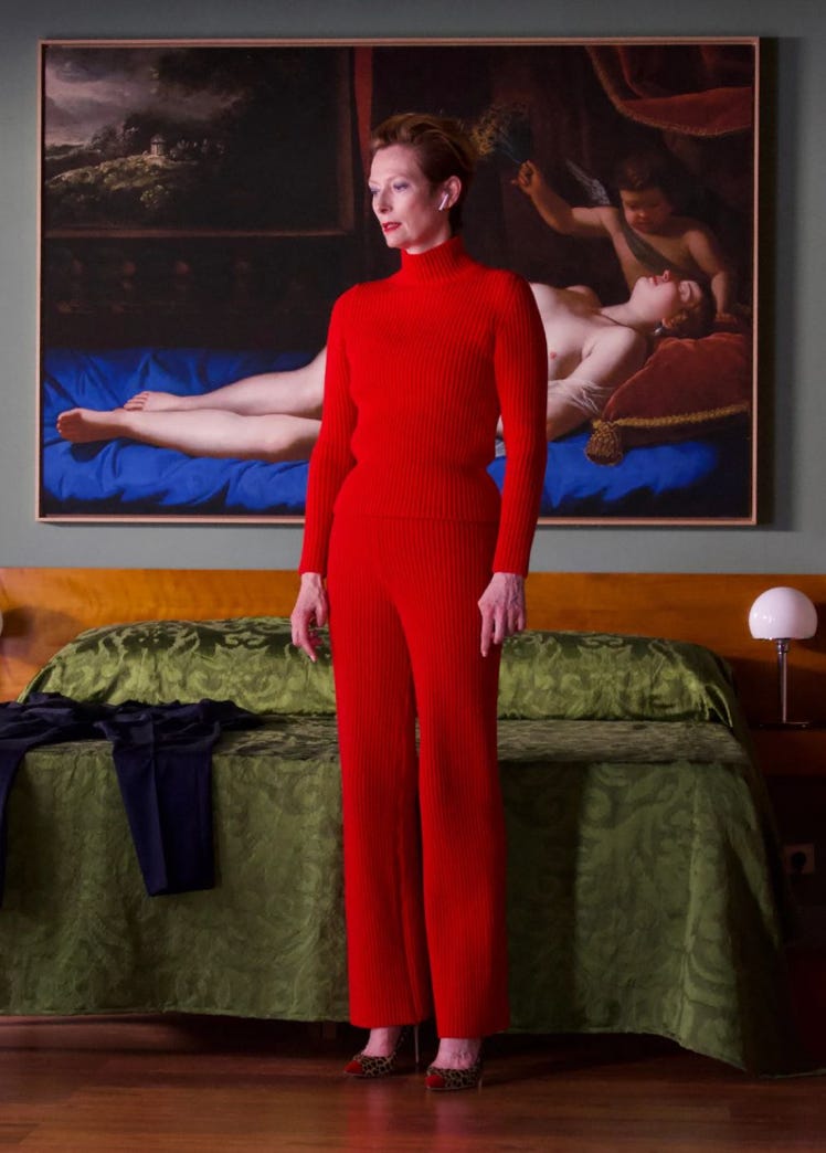
I just saw the new Pedro Almodóvar movie, The Room Next Door. Julianne Moore and Tilda Swinton star in this intimate, thought-provoking film that explores the friendship of two women; one of whom has terminal cancer. I highly recommend it and can’t stop thinking about the story and the visuals. Like Wes Anderson and David Lynch, who sadly died this week, Almodóvar creates a distinct world that permeates every aspect of his films and leaves an indelible impression on the viewer.
Almodóvar’s world is constructed in saturated, primary colors, juxtaposed with split complementary colors to dramatic effect. The wild mix of hues envelops the characters and sets, embedding a strong visual message impossible to forget, and easy to conjure long after the movie has ended. As emotionally invested as I was in the story my antenna couldn’t help but buzz with the visual stimulation I was treated to. It solidified everything I’ve been thinking about concerning color.

As crazy as it sounds, I was so inspired when I got home that night I couldn’t sleep and stayed up until 2:00 hunting for clothes in saturated colors to incorporate right now into my wardrobe. This late in the season any purchases I make have an eye to the long chilly transition weather ahead. I’m also thinking about my upcoming trip to Spain on the coast of the Mediterranean this spring. When inspiration hits you have to go with it. I switched the story I planned to do for this post and jumped right into assembling outfits incorporating my desire for color. Here’s what I came up with, with an explanation of what I’m going for.

Camel is the ideal mixer for saturated color, it goes with everything. Here I’ve paired the camel skirt with a kelly green cashmere sweater. Deep burgundy accessories play nicely off the camel and the green to add another layer of color interest. A scarf at the neck ties it all together though I would have preferred it with a dark ground instead of white. I’m all for chunky jewelry. This lab-grown sapphire ring looks much more expensive than it is. The boots you can find here and the tights here.

Dressing in color doesn’t have to be complicated, though it requires more planning. Be willing to experiment and trust your eye. Nature is the best teacher, flowers have the most daring color combinations to beautiful effect. The cobalt blue cashmere sweater, violet-red scarf, and vicuna pants are all of the same value creating harmony among the disparate colors. Again I chose burgundy accessories. I love burgundy shoes and bags, they work with black and grays as well as warm browns and olives. The ring and earrings are from my vintage jewelry edit. I love the boots, though they’re expensive, here’s a good alternative. The bag can be found here. Most of the items are on sale.

This outfit goes full color with Issey Miyake Pleats Please pants in violet paired with a royal blue sweater. To tone the look down a bit I added a brown scarf and a black suede boot. I would wear a black coat over it. Tortoise retro sunglasses from Gucci are on sale here.
As you can see the shapes are still simple and timeless. The addition of saturated colors brings interest and newness to familiar shapes. I hope this inspired you to give bold color a chance if you’ve been wearing mainly neutrals, as many of us have lately.
Thank you for reading. I would love to hear your thoughts on how you use color in your wardrobe. And a quick survey to leave in the comments below; Who else is feeling strongly about color this year?
xxx Jolain
I love colour and all the infinite ways they can be mixed together. This is absolutely correct:
“Nature is the best teacher, flowers have the most daring color combinations to beautiful effect.”
Whenever I think about putting a couple of colours together, I try to remember seeing it in nature first. I don’t shop online so I am at the mercy of the Thrift Gawds, but I prefer saturated shades. When I’m building an outfit in my closet, I have to hold things up to each other- sometimes this results in unexpected combinations, like yellow and turquoise!
I love Almodovar and his recurring saturated colours, especially red. What an inspiring edit Jolain, I love how you always find a way to make art and clothing meet